Making event planning easier than ever.
CLIENT WORK: END-TO-END RESPONSIVE WEB DESIGN

OVERVIEW
Moyeo is a comprehensive event hosting website, offering users seamless event creation, friend invitations, and guest list management. Partnering with an engineer client, I spearheaded the product design process, ensuring alignment with the brand vision and identity. In this case study, I'll guide you through the MVP version of the final product, slated for launch later this year.
Team
Sarah K - Product Designer (myself)
Kevin H - Full-stack Engineer
Duration
Jan - April 2024 (150+ hours)
Tools
Key Skills
UX Research, Qualitative Interviews, Visual Design, Wireframing, Prototyping, User Testing
OVERVIEW
Hosting & planning events can be challenging and time-consuming.
For frequent event hosts, managing invites and guest lists can be cumbersome. What if there was a website that streamlined event creation, sharing with guests, and managing attendees in one place? My client sought to address this need, with a Korean audience in mind.
MY ROLE
As the sole Product Designer for this project, I navigated the design thinking process from research all the way to prototyping phase. I was responsible for all the design aspects of the project and ensured smooth communicating and updates with the engineer throughout the project.
GOALS
We decided to craft a product that caters to event hosts of small events, and position the product to appeal to Korean user base.
I came up with high-level goals:
01. Help users who host smaller parties and events organize their events better.
02. Help users to manage their guest list effectively.
03. Incorporate elements that will make the product relevant and appealing to Korean user base.
PROPOSED SOLUTION
We will develop an MVP website that will help users create, organize, and manage events efficiently.
Key features:
Simple and easy way to create and organize event.
Dashboard where the users can view and manage upcoming events.
Easy way for users to keep track of guest list.
Incorporate functions that will make it relevant for Korean user base.
Research
RESEARCH GOALS
Before diving into research, I clearly defined our research goals first.
Since we were planning on building out a new product from scratch, it was important to set specific research goals.
01. Identify specific needs and frustrations of small-to-medium-sized event hosts and use this information to develop a user-centered service that meets their needs.
02. Determine the most essential features and functionalities for the event planning website and prioritize these features baed on user feedback and market research.
03. Understand the current market and the competitors for similar website services, then use the information to create a point of differentiation for our product.
COMPETITIVE ANALYSIS
Narrowing down the competitors.

Luma

Eventbrite

Meetup
The goal of the research was to analyze how each of the competitors meet their users' needs through SWOT Analysis. (to the right)
Each of the competitor had slightly different target audience:
Luma - geared toward users who are hosting smaller, more private events.
Eventbrite - more for larger organizations and corporations that hosted various public events in different cities.
Meetup - a wide range of events and groups as their target audience.

QUALITATIVE RESEARCH
A bit of a challenge finding interviewees…
It was important to gather real data through user interviews. However, there were some difficulties in finding users who frequently host events. Due to the time constraint we were working with, I couldn't find users who were event hosts. Instead, I asked my interview participants hypothetical questions as if they were event hosts. I also supplemented my research with secondary research scouring through online blogs and threads that were written from a perspective of event hosts.
Show interview details
Defining the problem
AFFINITY MAP
Using affinity map, I grouped together common themes and visualized patterns from the interview results. I also supplemented my interview findings with secondary research.

Key Takeaways

01 Simple & minimal design
When exploring about the overall design concept, most users mentioned they would prefer a more simple and minimalistic aesthetics of the website.
02 Suggested core features
Some participants brought up core feature ideas such as a section to indicate whether guests are allowed and section for specific requirements.
03 Guest perspective
From a guest perspective, all the users concurred on wanting to use the website as a guest without having to sign up. Participants also mentioned they are more likely to check in to events on their mobile (not desktop.)
04 Integration of Korean apps
Integrating Korean payment method and social media such as Kakaotalk and Kakaopay will be critical in optimizing user experience for Korean user base.
TARGET USERS
Using the synthesized data from my interviews, I created Lisa the Ambitious Networker as a primary user persona to reflect the needs and pain points of the real users.
Lisa the Ambitious Networker

OPPORTUNITY
I asked an overarching question to find opportunities for solutions. Then, I asked two sub-questions followed by potential ideas that address each question.
How might we develop an inexpensive and simple solution for event hosts to streamline the process of hosting and managing events?
BREAKING DOWN THE PROBLEM
01 Make a responsive design, so both hosts and guests can access the events easily.
02 Intuitive and straightforward flow to create a new event.
03 Easy way to update/edit events, and share the event updates with guest list.
PRIORITIZATION
Determining core features for the MVP
Initially, the engineer shared a list of features he would like to implement. Using feature suggestions from user interviews, affinity mapping, and asking the right questions above, I created a feature prioritization for each screen. Once I organized feature ideas based on priority, I confirmed the core functionalities with the engineer before stepping into the ideation phase.
Create event page
event location map, main image, language option, requirements
Event confirmation page
guest list tab, share event
For the guest
visibility of other guests attending, easy QR code check-in
View Feature Matrix
Ideation
SITE MAP
The app started from scratch, so I drafted a site map to provide a visual structure and help organize the contents. Since we were focused on developing an MVP and working under a time constraint, I created a site map based on the core functionalities. (The site map went through several revisions according to the iterations.)

USER FLOWS
How would the users navigate through main workflows?
I prioritized 3 user flows in order to help users achieve their goals. I crafted the 3 flows below:
Sign in / Sign up
Create new event
Share the event via social app

Design
LOW-FI WIREFRAMES
Making layout decisions with initial exploration.
Having mapped out the information architecture and the features to include, I explored the layouts with low fidelity wireframes. I sketched digital wireframes of various layout versions for each of the key screens. The initial wireframes took into account the core functionality. I sketched multiple versions of the wireframes to determine which screens are more intuitive. Gathering feedback at this stage will save time and resources further down the road. For this reason, I validated my layout decisions by gathering feedback and votes from design fellows and mentors.
MID-FI WIREFRAMES
⚠️
Wait, what about the responsiveness?
Since this was my first time working with responsive design, I initially only made low-fidelity wireframes for the desktop version. After consulting my mentor, I quickly realized I need to take the mobile responsiveness into account for this project. Since I was lacking low-fidelity wireframes for mobile screens, I developed both mobile and desktop wireframes for mid-fidelity stage and ensured the screens are responsive.

UI KIT
Making a major UI change during the design phase.
While working on the wireframes, I continued to communicate my design decisions with the engineer and design peers. Initially, the main UI button color was bright green. Even though the button itself was an bright CTA button color, I realized it didn't contrast very well with the light purple background. After experimenting, our team changed the final button color to dark purple, which provided a better contrast with the background.
Hey, how about the button colors? Can we make UI improvements here?

Kevin the engineer

Test
USER TESTING
Testing with mid-fidelity prototype.
I tested with 5 new participants for the user testing. Each session was between 30-45 minutes, and was conducted online as moderated user testing. After the user testing, I made iterations based on the user feedback.
USER TESTING #2
A/B testing 2 different workflows
After making iterations, I conducted a second user testing. This time, the purpose of the user testing was to test out two workflows. I was curious to find out which workflow the users preferred, and which workflow will lead to more sign ups.
Workflow 1

User clicks "Create an event"—> directly to creating an event page. —> User needs to go through sign up/ sign in first —>Once signed in, user can fill out the event page.
Workflow 2

User clicks "Create an event"—> directly to creating an event page. —> Lets user fill out the event first —> Then, user needs to go through sign up/ sign in to view event confirmation.
Testing Takeaways
Test #1: general feedback
I was able to gather some very insightful feedback from the users. Based on the feedback and questions users had, I made major changes which will impact the overall usability of the product.
Test #2: worklows
I tested two different workflows. The verdict was users preferred Workflow 1 due to it's straightforward navigation. As for the final design, I decided to go with Workflow 1.
VIEW ITERATIONS
Dashboard
Before

After
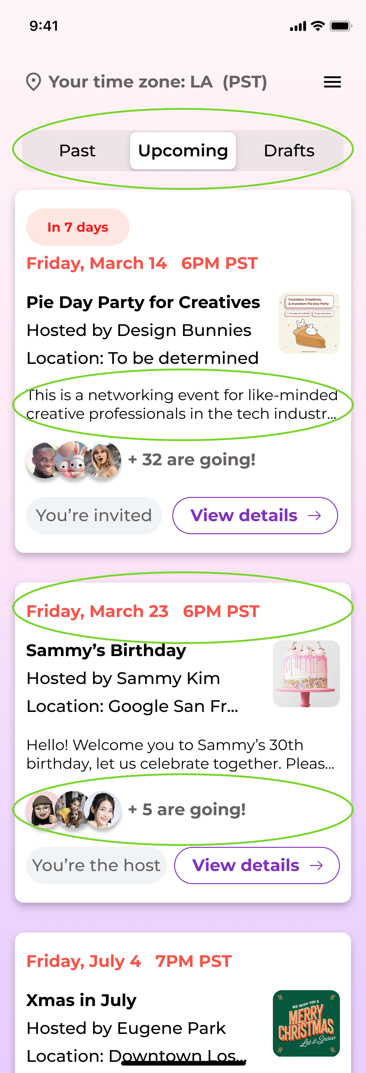
For the option to view upcoming vs. past events, I changed the dropdown to a 3-section toggle. This gives users a clear view of the options available, and much easier to switch back and forth.
Users felt that it was hard to notice the dates of the events because it was in the middle of the content. I moved the date to the top of the card for a greater visual hierarchy. I also added a tag for the most recent upcoming event as a reminder for the users.
Create event
Before

After

The details of the event information was too visually cluttered. I refined the overall UI of the dropdown bars to improve UI consistency across mobile and desktop versions. I also added the "go back" button to ensure the users can go back to the previous page.
Event overview
Before

After

The old version of the event overview page didn't fully capture all the information on the desktop version. To make it fully responsive, I ensured to include all the functionality and information in the mobile version.
I also enhanced the user experience by adding user's time zone on the top, and changing the "overview / guest list tab" into a bar for UI consistency between desktop and mobile.
Guest list tab
Before

After
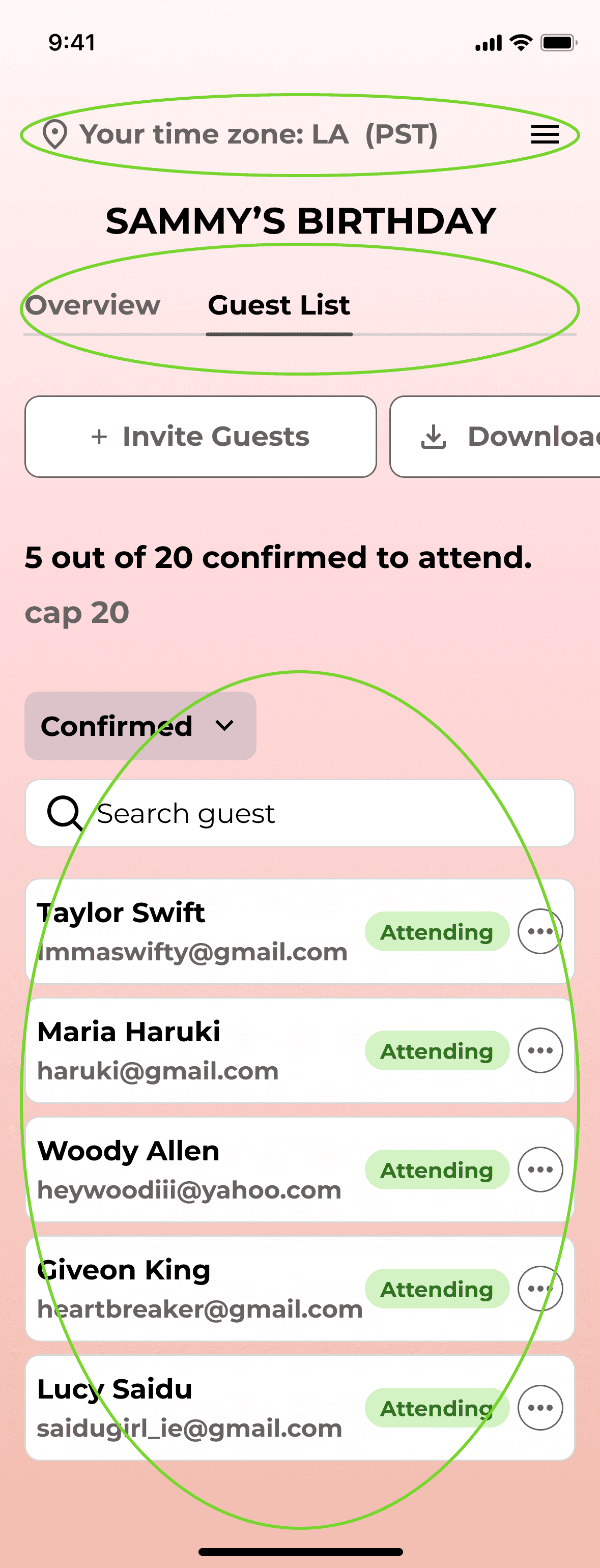
For the guest list tab, I grouped together similar items such as "guest dropdown," "search guest," and the "guest list."
I also refined the overall UI for better visibility.
Guest - join event
Before

After

Users mentioned there wasn't enough information about the event in the old version (from guest perspective). Taking this feedback into account, I refined the invitation portion and made it a lot more comprehensive to communicate all the important details about the event.
A critical point here is showing visibility of other confirmed guest, which is more likely to encourage the guest to check in.
I also added a "Sign Up/Sign In" CTA button on the top, encouraging guest users to make an account.
Guest - confirmation
Before

After

For the guest confirmation page, having a QR code is an easy way to check in. However, the initial check in page was way to simple. I added "add to calendar" and "share event" buttons to give more options to the guest users. The response form has also been refined.
The "final" design
Landing page with one clear goal
Landing page communicates a clear goal of Moyeo - core functionality of creating an event. The intuitive and straightforward design encourages users to get started with creating a new event right away.
Intuitive flow to create an event & view events in dashboard
Once users start creating a new event, there are sections for all the necessary details of the event. Users can include requirements as well as the invitation card image for customized invitation. Users can save event as draft in case the event isn't confirmed yet. Users can also view all the scheduled events (both hosting and invited) in the dashboard, which shows primary information about the events in chronological order.
Easy check-in system for guests
From user interview, it was clear that guest users prefer not to sign up to check-in. Taking this account, guest users can simply check-in for events without having to sign up for Moyeo. Once registered, they can use the QR code generated to attend the event. Guest users can also view other guests who are confirmed to attend, providing them the incentive to register earlier.
DESKTOP VERSION - FULL FLOW
Reflections
Takeaways
In this project, I got to collaborate closely with an engineer which was a great opportunity to learn more about technical constraints, teamwork, and hone my communication skills regarding design decisions. Beginning from user research, I communicated key insights with the engineer, and through collaboration, we made some pivotal decisions. Due to the nature of the product, I also honed my design skills in developing responsive design for both desktop and mobile versions.
Next steps
We are planning on launching the product toward the end of year.
How will we measure success and the impact of this product? We will measure user satisfaction, user adoption, sign-up through the CTA button, etc.
This version of MVP will continue to evolve. Design is never fully "final" and constant iteration is key to a successful design.


