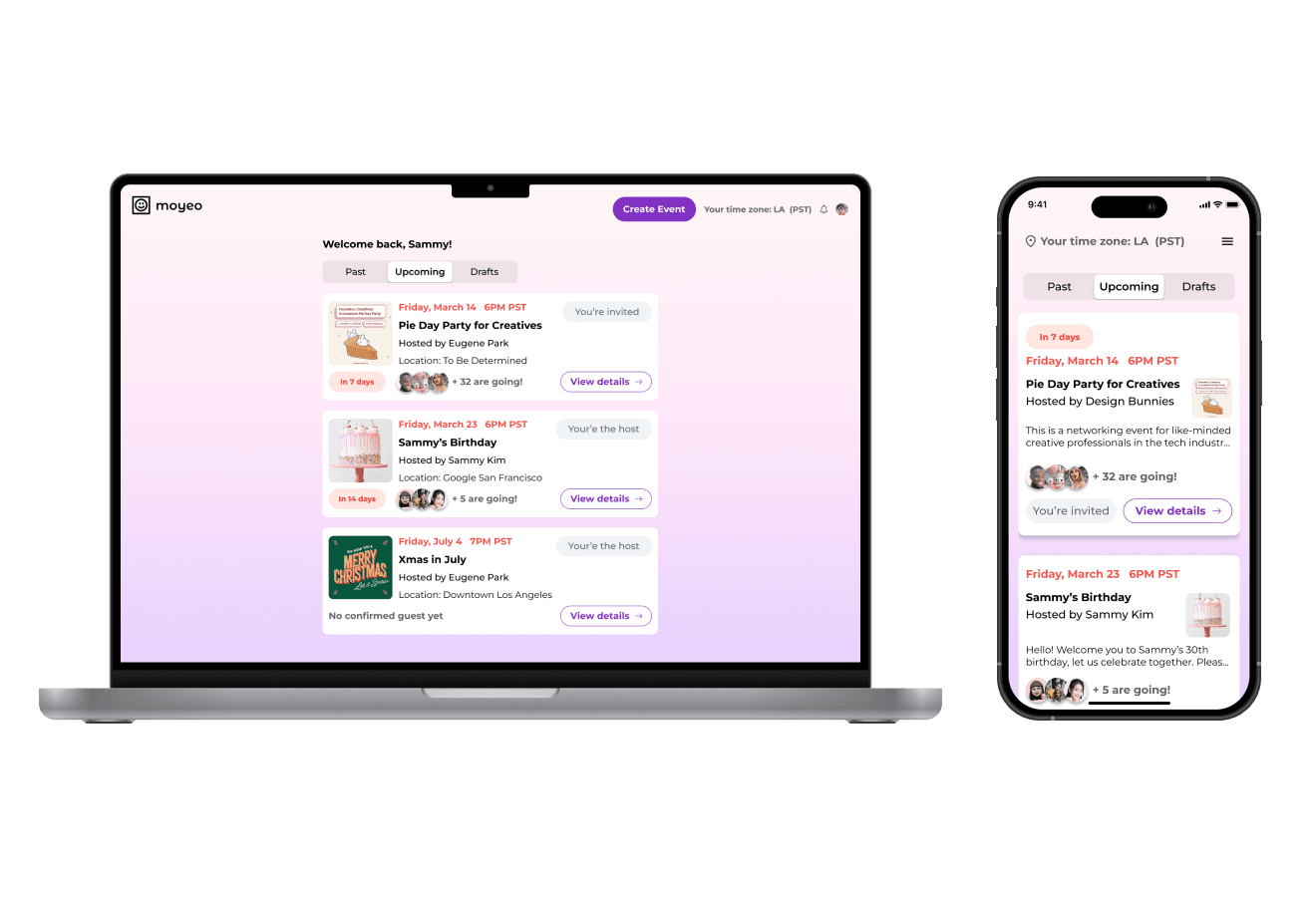
Streamlining the dating process
with a Date Invitation Card.
DESIGN CHALLENGE: HINGE APP


OVERVIEW
Hinge is an internationally acclaimed dating app that garnered its popularity in the recent years. With the introduction of dating apps, it's been easier than ever to meet individuals beyond one's social circle. However, despite the advanced algorithm, finding a compatible match still is a challenge for many. In this case study, I investigate common problems users are experiencing and offer a new feature idea that will lead to increased user engagement.
Note: This project is a conceptual project and has no official affiliation with Hinge.
Team
Individual
My Role
Product Design, Research
Duration
Dec 2023 - Feb 2024 (100 hours)
Tools
Figma, ChatGPT, Maze
Skills
User Research, Ideation, Interation Design, Design Systems, Wireframing, Prototyping, Testing
THE PROBLEM
Users may get matches, but very few of them turn into real dates.
At the outset of this project, I did some quick research to get a grasp on what the Hinge users' pain points are. The majority of users online were frustrated with how many conversations tend to fizzle out and don't lead to anything. They may get a lot of matches, but very few of them turn into real dates.
THE GOAL & OBJECTIVE
Adding a new feature to increase user engagement. I came up with high-level goals below:
Give users more options/ways to engage with each other.
Make it easier for users to go on dates.
Ultimately, add a new feature that deepens user engagement.
THE SOLUTION
Introducing "Date Invitation Card," a feature that helps users skip the line and meet face-to-face.
01
Send the invitation card to stand out from the crowd.
The date invitation card feature on Hinge enables users to ask someone out directly, expressing special interest in a more intentional manner. Shy users can utilize this feature post-match, offering a cute way to ask someone out during the chat.
02
Customize your response upon receiving the invitation.
Upon receiving a date invitation, users can choose to either accept and respond or simply match with the sender. If accepted, users can propose alternative date types and availabilities. Scheduled dates are conveniently displayed on the Match page. Invitations automatically expire after 5 days if left unanswered.
03
Matched and going on a date? Let's share each other's contact.
Once users match or accept a date invitation, they can engage in chat. The "Share Contact" button offers a convenient method for users to exchange contact information effortlessly. By clicking the button, users can avoid the need to manually type out their information each time.
Let's see how I got to the solution 👇🏼
QUALITATIVE RESEARCH
Tapping into the minds of the users.
Key objectives:
What is their goals and motivation for using dating app?
What are some of the key frustrations?
What are some of the positive experience vs. negative experiences?
Details:
6 interviewed
Age: 20 to 35
4 of the users were Hinge users
2 of the users used other dating apps
View Interview Debrief
AFFINITY MAPPING
3 key insights from the interviews.
View Affinity Map
01. Going on dates
100% of the users mentioned once they match with someone, they would rather go on dates as soon as possible to find out if they are compatible.
02. Favoring special likes
50% of users said they are more likely to match when they receive special likes, such as "Roses" and "Super-likes."
03. Suboptimal conversations
Users were frustrated that with conversations. Even after matching, a lot of those matches fizzled out due to lack of initiative and intentionality.
The Discovery

"To my surprise, all the users preferred to meet in person as soon as possible to find out if they are compatible."
The user interviews validated the initial hypothesis that most users would rather meet in person faster to figure out if they are a good match. While I had hypothesized this, I was surprised to hear this from the users. This result was agnostic to user's gender. The real struggle was at converting the matches to dates, and continuing the conversations once matched.
PERSONAS
Empathizing with the users.
With the research insights, I created 2 distinct personas. It was important to have two personas represent each gender because there are different approaches to using dating apps based on the user's gender, therefore different motivations, goals, and pain points.


DEFINING THE SCOPE
From the research insights, it was clear that users were most frustrated with after matching experience. Despite matching with many people, only a few of those conversations continued, if at all. The rate of going on dates from those matches, seemed even smaller. After referring back to the interview insights and collected information from personas, I decided to zoom in on the How Might We question below.
"How might we increase the likelihood of users going on more dates?"
BRAINSTORMING
Exploring various feature ideas.
I used the Crazy 8s method to brainstorm different feature ideas. The ideas address the two How-Might-We questions above. The first row addressed ideas related to improving conversations. The second row addressed ideas related to going on dates.

FEATURE DECISION
Feature that will expedite the process of going on dates.
After exploring new feature ideas, I decided to focus on a feature ideas that will encourage users to go on more dates. A supplementary feature to this, Share Contact button will make it easier for users to exchange contacts with multiple people once they match.
💌 01. Date Invitation Card
This new feature is a solution to help users go on more dates seamlessly. A date invitation card can be used before or after matching with a person.
📞 02. Share Contact Button
A supplementary feature helps users share contact information more easily during the chat, which encourages the users to continue communication.
INFORMATION ARCHITECTURE
User flow diagram
I began mapping out the user flows for the new features to demonstrate clear action steps users will take for each task. I mapped out a flow for users sending a date invitation card and another user flow where users share contact information using a button during the chat. I captured both the happy paths (user uses the new features successfully) and the alternative paths (user deviates from the ideal path) to account for various scenarios.

LOW-FI WIREFRAMES
Making layout decisions
Once I determined the site map and user flows, I proceeded to ideate on different layout versions. At this stage, it was important to sketch various layout options to gather feedback before solidifying the designs in the next stage. I did sketches for both workflows of "sending" and "receiving" the card. Then I consulted with my design mentors and peers to gather feedback to make layout decisions.
Sending the card

Receiving the card

Show details
UI KIT
Following Hinge's Design System
For the UI portion of the project, I built the UI kit while working on mid-fidelity wireframes. Given that Hinge already has an existing design system, I conducted research to identify the appropriate typography, style, and UI components. I then meticulously crafted the UI kit to develop a coherent design for the new feature.

HIGH-FI WIREFRAMES
Creating high-fi wireframes
High-fidelity wireframes were created after the first user testing. Taking the feedback from use testing #1, I made iterations and revisions to the mid-fi wireframes. Then, building upon the mid-fi, I created high-fi wireframes by refining the visual elements, including realistic images, using the correct typography, and polishing Hinge's existing icons to create the most realistic representation of the final product.
View High-Fi Wireframes
USABILITY TEST #1
Quick testing to gauge user perception
For the first user testing, I tested with 5 participants who were all Hinge users as a moderated online test for 45-minutes session.
Task flows:
Sending the date invitation card.
Receiving and responding to the date invitation.
Sharing number using share contact button.
Test goals:
Identify any area of improvement.
Measure the usability of the new features.
Gauge the overall user perception of the new features.
Second round of user testing to gain deeper insights.
I decided to conduct another round of user testing after making iterations and developing a high-fidelity prototype. I tested with 5 new participants. Below, you can view the detailed changes that were made after two rounds of user testing.
KEY ITERATIONS
Help & Documentation for Clarity
Some users mentioned it was unclear how this feature works exactly.
New Feature pop-up: I incorporated a pop-up message to introduce the new feature.
Information button: The information button provides users with support and control.
New feature

Information button

Offering More Date Type Options
When sending a date invitation, users can propose different types of date.
Initially, date options were limited to "coffee" and "meals." In response to feedback, I expanded categories to include "indoors" and "adventurous" for greater variety.
Additionally, users can create custom date types.
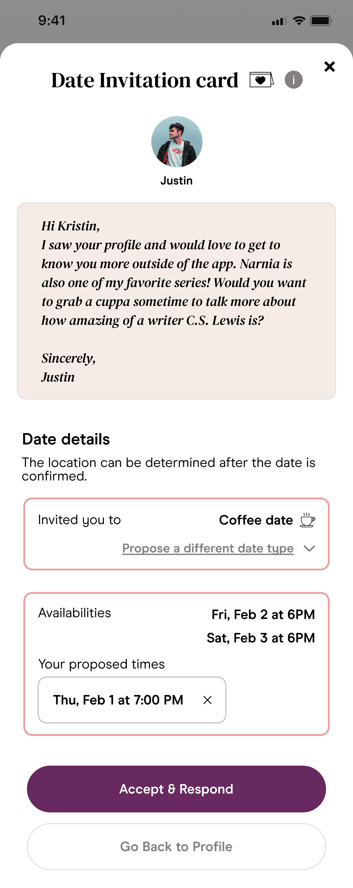
Responding to the Date Invitation
Participants strongly disapproved of the term "declining an invitation" because it implied they could no longer view the sender's profile.
Outcome:
"Go back to profile" button: Wording changed from "decline" to "go back to profile" to offer users the choice to match without feeling pressured to accept the invitation.
Date location information: Added location details to clarify next steps.
"Go back to profile"

Date location
Reminder for Invitations
Outcome:
Reminder tag in Match page: Users can see which matches sent them a date card and the time remaining until expiration, fostering a sense of urgency and potentially increasing date acceptance rates.
Reminder tag in chat rooms: A reminder tag is displayed prominently at the top of the chat room, encouraging users to respond to the invitation.
Reminder tags

Tags in chats

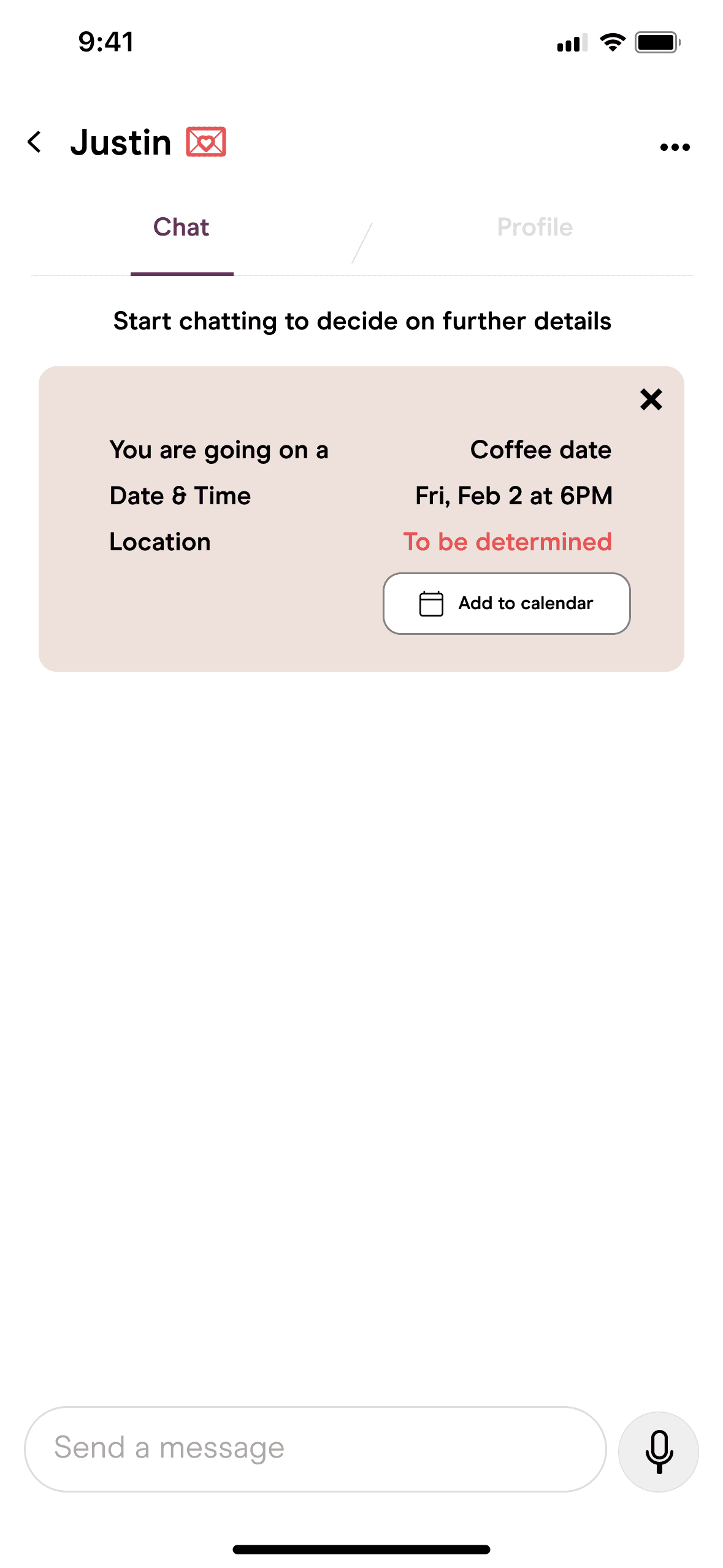
Managing Upcoming Dates
It was crucial for users to have the ability to view and track scheduled dates.
Outcome:
Scheduled date information: Date information is now included once users match, simplifying the process of making specific plans.
Refining "Upcoming Dates": Emphasized key details (date and time) and added a "View Details" option for enhanced clarity.
Date information
Upcoming dates

NPS SURVEY
78.5% of Hinge users were likely to use this feature and recommend it to their friends.
I conducted an anonymous survey after the project ended. 10 Hinge users answered the survey.
The survey question asked, "On a scale of 1 to 10, how likely would you use this feature and recommend it to a friend or other Hinge users?"
"Probably an 8. In practice, I could see maybe getting overloaded with too many date cards from guys, but I really like it as a way to break the ice and get to see someone you're hitting it off with. The data category suggestions are cute too!"
"I will give it a 9. It seems very useful and much more action-oriented than sending a Rose."
MEASURING THE IMPACT
How would I measure the impact of the new feature?
For Date Invitation Card:
Measure the number of invitation cards sent out.
Measure the number of invitation cards acceptance.
Measure the percentage of dates made through the use of this feature.
For Share Contact button:
Measure the number of times contacts were shared via the button vs. without using the button.
REFLECTIONS
Takeaways
Working with established brands like Hinge emphasized the importance of thorough market research and early data collection. This preparation enabled me to ask pertinent questions during user interviews, which are crucial for extracting genuine user needs and shaping effective design solutions. Furthermore, engaging with current Hinge and other dating app users provided valuable insights and feedback, reinforcing the significance of user testing.
Favorite part of the project
Shortly after completing this project, a friend forwarded me an article about a recently launched dating app start up in San Francisco called "Soon." Its concept closely mirrored my date invitation card idea, emphasizing offline meetings and minimizing online interaction. Discovering this app served as significant validation for my UX research and feature concept.
Next steps
Conduct more post-launch surveys to gauge more accurate user perception.
Measure the impact of the new feature - how many users sent out the card? how many users responded positively to the date card invitation? How many dates were connected through the use of date card invitation?