Client Work - End to end website design
Moyeo

View Prototype
Team
Product Designer (myself),
Full-stack Engineer (Kevin H.)
Duration
Jan - April 2024
(150+ hours)
Tools
Skills
Competitors' analysis, user interviews, wireframing, prototyping, user testing
Overview
Make hosting events easier than ever.
Moyeo is a comprehensive event hosting website, offering users seamless event creation, friend invitations, and guest list management. Partnering with an engineer client, I spearheaded the product design process, ensuring alignment with the brand vision and identity. In this case study, I'll guide you through the MVP version of the final product, slated for launch later this year.
Problem
Hosting & planning events can be challenging and time-consuming.
For frequent event hosts, managing invites and guest lists can be cumbersome. What if there was a website that streamlined event creation, sharing with guests, and managing attendees in one place? My client sought to address this need, with a Korean audience as potential target audience.
Goal
We decided to craft a product that caters to event hosts of small events, and position the product to appeal to Korean user base. I came up with high-level goals:
01. Help users who host smaller parties and events organize their events better.
02. Help users to manage their guest list effectively.
03. Incorporate elements that will make the product relevant and appealing to Korean user base.
Proposed Solution
We will develop an MVP website that will help users create, organize, and manage events efficiently.
We aim to incorporate main functionalities as below:
Simple and easy way to create and organize event.
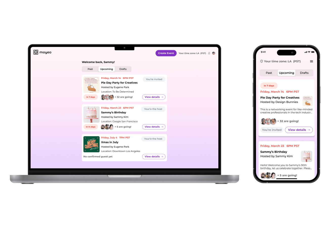
Dashboard where the users can view and manage upcoming events.
Easy way for users to keep track of guest list.
Incorporate functions that will make it relevant for Korean user base.
My Design Process
Discover
Research Goals
Before diving into research, I clearly defined our research goals first.
01. Identify specific needs and frustrations of small-to-medium-sized event hosts and use this information to develop a user-centered service that meets their needs.
02. Determine the most essential features and functionalities for the event planning website and prioritize these features baed on user feedback and market research.
03. Understand the current market and the competitors for similar website services, then use the information to create a point of differentiation for our product.
Market Research
With the research goals in mind, I narrowed down to 3 direct competitors in the market.

Luma

Eventbrite

Meetup
The goal of the research was to analyze how each of the competitors meet their users' needs through SWOT Analysis. (to the right) This will serve as a strong foundation in setting the direction of Moyeo.
Each of the competitor had slightly different target audience. Luma was geared toward users who are hosting smaller, more private events. Eventbrite was more for larger organizations and corporations that hosted various public events in different cities. Meetup had a wide range of events and groups as their target audience.

Qualitative Research
Better empathizing with users through qualitative interviews.
It was important to include some users who are based in Korea to look out for specific needs of a Korean user base. I also interviewed participants for both host perspective and guest perspective as users.
With these key findings in mind, we proceeded to synthesize the interview results in affinity mapping.
Define
Identifying patterns with affinity mapping.
Affinity mapping helped us group together common themes and visualize patterns from the interview results.
View Mapping

80% mentioned they would be more inclined to use the desktop version if they were hosting.
60% would like to see the guest list on the main page once the event is created.
40% asked how they can include specific event requirements when they are creating an event.
How Might We
Asking the right questions to determine core features & functionalities.
Once we synthesized the research findings and data from affinity mapping, we came up with 3 How Might We questions below.
Creating events
How might we streamline the process of creating an event all the way to sending out the invitation?
Event information
How might we ensure the user can communicate all the necessary information in the invitation?
Managing guests
How might we ensure the host can manage the guest list easily and share additional updates about the event?
Personas
I created Lisa the Ambitious Networker as a user persona, using data from research, reflecting the needs and pain points of the real users.
Lisa the Ambitious Networker

Ideate
Feature Prioritization
Translating the feature ideas into real features.
Using feature suggestions from user interviews, affinity mapping, and user persona, I created a feature prioritization matrix. Once I organized feature ideas based on priority, I confirmed which core functionalities to execute on.

Site Map
Once the features were confirmed, I decided to create a site map before the design phase. This was a pivotal step in this stage of development - having a visual structure to help organize and clarify the content that needs to be on the site, and eliminate unnecessary pages. Since we were focused on developing an MVP version and working under a time constraint, I created a site map based on core functionalities. (The site map went through several revisions according to the iterations. The site map below is the final version.)

User Flows
How would the users navigate through main workflows?
We prioritized 3 user flows in order to help users achieve their goals. By focusing on these 3 user flows, we were able to prioritize the essential steps the users will go through to accomplish each goal.
Sign in / Sign up
Create new event
Share the event via social media (Korean messenger app, Kakaotalk)

Design
Low-Fi Wireframes
Making layout decisions with low-fi wireframes.
Once we confirmed the features to integrate, we went straight into design phase. For each of the key screen, I sketched digital wireframes of various layout versions. It was important to sketch multiple versions at the low-fidelity stage to determine which screens are more intuitive and user-friendly. Gathering feedback at this stage will save time and resources further down the road. For this reason, I shared low-fidelity sketches with design fellows and mentors, and have them vote for which versions they preferred.
Mid-Fi Wireframes
Making a major change in UI decisions.
For mid-fidelity, the screens became a lot more defined with colors, typography, and images. One major change that was made at this stage was the primary color. Initially, the primary CTA color assigned was a bright green color. After developing the wireframes, I gathered feedback from design peers. Some peers mentioned that purple gives a better contrast and contributes to a more coherent branding. Upon discussing with the developer, we made the decision to unify the brand color to purple, replacing the button colors to dark purple.


View Wireframes
UI Kit
While working on the wireframes, I put together a style guide and organized all the important UI components into a UI Kit. The UI Kit was updated accordingly when there was a major change in the primary color.

Prototype & Test
User Testing
Testing with mid-fidelity prototype in the earlier stage of design.
We decided to conduct user testing once we developed mid-fi prototype. I tested with 5 new participants for the user testing. Each session was between 30-45 minutes, and was conducted online as moderated user testing.
Incorporating User Feedback
Create an event page
"Where can I include specific requirements for the event?"
Users wanted there to be a section where they can write specific requirements for the events. (what to bring, dress code, age requirement, etc)

Add a separate section where users can write out specific requirements.
Event confirmation page
"Can I view all the confirmed attendees on this main page?"
Users mentioned they would like to see guests who are confirmed to attend in this page.
Switch to view the profile easily while filling out the card.
Dashboard
"What if the events are held in different time zones?"
Users wanted there to be mention of what timezone they are currently in.
I included a reminder message to create a sense of urgency and an incentive for users to respond.
Key Revisions
Dashboard
Adding timezone

Create Event
Requirements

User Testing #2
Running a second round of user testing, this time, with a focus on comparing different workflows.
The first user testing was helpful to gather early feedback and perception from the users. I decided to conduct a second user testing with more refined high fidelity prototype. This time, the purpose of the user testing was to test different workflows. There were 2 workflows I developed, as below:
User Test Brief:
Unmoderated user testing using Maze
Tested with 7 new participants
Users were asked to go through 2 different workflows and provide feedback on which version they preferred
Version 1
When user clicks on "Create an event"CTA button, it leads directly to creating an event page. However, the background is blurred, user needs to go through sign up / log in first.

Version 2
When user tries to create an event from the landing page, it leads to create an event page. This version allows users to fill out the details of the event. When the user wants to move onto the next stage, then it asks the users to sign up / log in.

View Prototype
Running a second round of user testing, this time, with a focus on comparing different workflows.
The first user testing was helpful to gather early feedback and perception from the users. I decided to conduct a second user testing with more refined high fidelity prototype. This time, the purpose of the user testing was to test which version of the workflow is preferred.
Solutions
write content
write content
If I had more time, I would do this
write content